
阅读 · Page
沉浸式资讯
key: immersive-reading
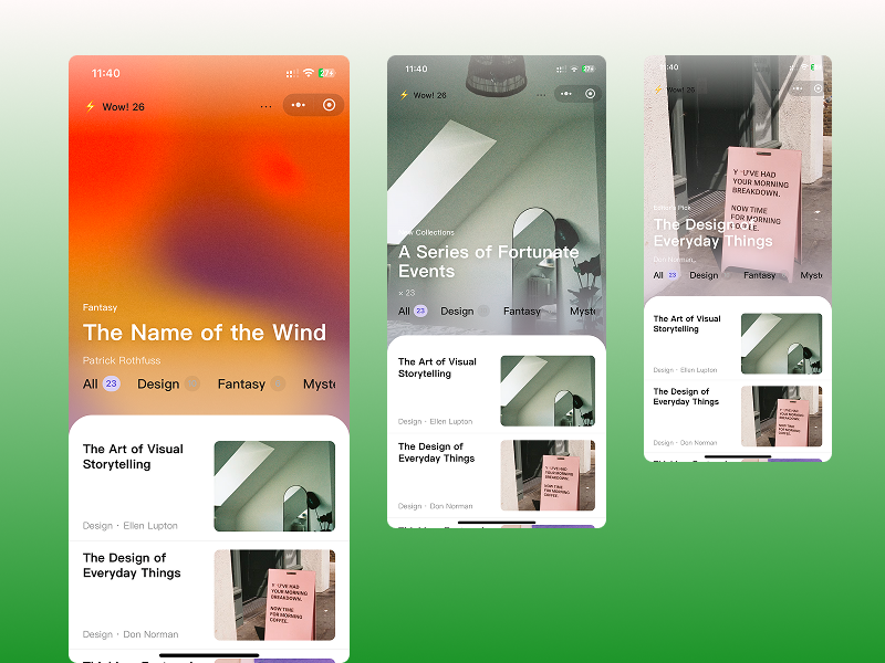
h5nativetarouniappeditorial-pop | 大胆排版
# 页面说明

数字阅读/书店首页。上半屏沉浸式轮播图,下半屏白色圆角内容卡片叠入
# 模块清单

## 1. 页面背景与分区

- **整体**:单页纵向滚动,无底部 TabBar
- **上区(`.hero`)**:占可视高度约 **65%**,内含轮播图 + 编辑推荐文案层 + Notice + 分类 Tab,无能内外边距;从上到下逐渐高斯模糊,**Tab 区域也需要模糊**
- **下区(Content Sheet)**:白色 `#FFFFFF`,**仅顶部大圆角** `border-radius: 32px 32px 0 0`(小程序 `64rpx`),向上叠在紫色区上,形成「卡片插入」效果
- **层叠**:白卡片 `margin-top: -48px`(小程序 `-96rpx`)压住紫轮播图底部

## 2. 轮播编辑推荐层 (Hero Editorial)

每张 `swiper-item` 除背景图外,叠一层**编辑感文案**(杂志封面式排版)。文案随轮播切换,与当前 slide 数据绑定。

### 容器

- **位置**:与轮播图同处 `.hero` 内,`position: absolute`,叠在图片与模糊层之上、Tab 之下
- **定位**:`left: 0; right: 0; bottom: 220rpx`(在 Tab `bottom: 130rpx` 之上,留出 Tab 高度 + 间距)
- **内边距**:`padding: 0 40rpx`(小程序,与 Notice / Tab 左右对齐)
- **层叠**:`z-index` 高于模糊层,低于 Notice;`pointer-events: none`(不挡轮播手势)

### 单项结构

```
.hero-editorial
  .hero-editorial__tag      小标签
  .hero-editorial__title    大标题(1–2 行)
  .hero-editorial__subtitle 副标题 / 作者(可选)
```

### 小标签

- 文案示例:`Editor's Pick` · `本周新书` · `New Collections`
- 字号 `13px`(小程序 `26rpx`),`font-weight: 500`
- 颜色 `#E8E0F4` 或 `rgba(255,255,255,0.85)`
- 与标题间距 `8px`(小程序 `16rpx`)

### 大标题

- **1–2 行**,左对齐,可换行(`white-space: normal`)
- 字号 `28–32px`(小程序 `56–64rpx`),`font-weight: 700–800`,`line-height: 1.1`
- 颜色 `#FFFFFF`
- 可选轻微文字阴影:`0 2px 12px rgba(0,0,0,0.15)` 提升在亮图上的可读性
- 与副标题间距 `12px`(小程序 `24rpx`)

### 副标题 / 作者(可选)

- 单行,超出省略
- 字号 `14px`(小程序 `28rpx`),`font-weight: 400`
- 颜色 `rgba(255,255,255,0.75)`
- 示例:`by Visualizee` · `Design · Don Norman`

### 切换动效(可选)

- `swiper` `bindchange` 时文案 **淡入 + 上移 12rpx**(`opacity` + `transform`,约 `300ms`)
- 禁止过重动画或遮挡 Tab / Notice

### 数据示例(每条 slide)

| tag | title | subtitle |
|-----|-------|----------|
| New Collections | A Series of Fortunate Events | × 23 |
| Editor's Pick | The Design of Everyday Things | Don Norman |
| 本周新书 | Thinking, Fast and Slow | Daniel Kahneman |

> 实现提示:文案层放在 `swiper` **外**、用 `current` 索引切换显示一条即可;不必在每个 `swiper-item` 内重复写 DOM。

## 3. 顶部通知条 (Notice)

- **布局**:`flex`,左图标 + 文案 + 右菜单
- **左侧**:闪电图标 ⚡ 或 SVG,约 `16px`
- **文案**:`Wow! 26`,`14px`,`#1A1A1A`,`font-weight: 500`
- **右侧**:三点菜单 `⋯`,可点击
- **内边距**:`padding: 12px 20px`(小程序 `24rpx 40rpx`)

## 4. 分类 Tab (Category Filter)

- **容器**
  - **位置**:与沉浸式轮播图处于**同一父容器**(如 `.hero`)内,**不要**拆成轮播区外的独立区块
  - **定位**:`position: absolute; left: 0; right: 0; bottom: 130rpx`,锚定在轮播区域底部,叠在轮播图下沿之上
  - **层叠**:`z-index` 高于轮播图,可被下方 Content Sheet 的 `-96rpx` 叠入遮挡一部分
  - 横向单行,`display: flex; align-items: center; gap: 24px`(小程序 `gap: 48rpx`)
  - 可横向滚动 `scroll-x`,不换行
  - 背景:透明或继承父级淡紫 `#C8B6E8` / `#E8E0F4`
  - 内边距:`padding: 12px 20px`(小程序 `24rpx 40rpx`)

- **单项结构**(重要)
  - `分类名` + `数量` 横向紧邻,**不要**给整项加胶囊底色
  - 布局:`display: inline-flex; align-items: center; gap: 6px`(小程序 `gap: 12rpx`)

- **分类名**
  - 字号 `15px`(小程序 `30rpx`)
  - 字重 `font-weight: 500;font-size:18px`
  - 选中:`#1A1A1A`
  - 未选中:`#1A1A1A`

- **数量角标**(仅数字有圆底)
  - 形状:正圆或 `border-radius: 999px`
  - 尺寸:约 `22×22px`(小程序 `44rpx`),数字居中
  - 字号 `12px`(小程序 `24rpx`),`font-weight: 600`
  - **选中态**:背景 `#D8D0F0`,文字 `#5A4FCF`
  - **未选中态**:背景 `rgba(0,0,0,0.06)` 或 `#ECECEC`,文字 `#B0B0B0`

- **数据示例**
  - `All 23` · `Design 10` · `Fantasy 6` · `Mystery 7`
  - 默认选中第一项 `All`

- **交互**
  - 点击切换选中态,仅改变文字颜色与数量标配色,无下划线

## 5. Content Sheet(书单列表)

- **容器**:白色 `#FFFFFF`,顶部圆角 `64rpx`,列表纵向排列,项与项之间可用细分隔线
- **单行(Book Row)内边距**:`padding: 12px 20px`(小程序 `24rpx 40rpx`)

### 单行布局(关键)

```
.book-row          flex 横排,align-items: stretch
  .book-row__left  flex: 1,左栏文字区
  .book-row__cover flex: 0 0 48%,右栏封面容器(固定比例)
```

- **整体**:`display: flex; align-items: stretch; gap: 12px`(小程序 `gap: 24rpx`)
- **禁止**左右都用 `flex: 1` 或都写 `width: 50%` 而不固定封面比例

### 左栏 · 文字区(约一半宽度,随封面等高)

- **布局**:`display: flex; flex-direction: column; justify-content: space-between`
- **高度**:与右侧 4:3 封面容器**等高**(由右栏 `aspect-ratio` 撑开行高)
- **上:标题**
  - 多行换行,左对齐
  - `font-size: 16–18px`(小程序 `32–36rpx`),`font-weight: 700–800`,`line-height: 1.25`
  - 颜色 `#0A0A0A`
- **下:分类 + 作者**(或「分类 · 来源」一行元信息)
  - 单行或两行,贴左栏底部
  - `font-size: 12–13px`(小程序 `24–26rpx`),颜色 `#9A9A9A`
  - 示例:`品牌官网 · 老鹰基金` / `Design · Don Norman`

### 右栏 · 封面图(4:3 横图)

- **容器**(必须用 view 包一层,不要只在 `image` 上写比例):
  ```css
  flex: 0 0 48%;
  aspect-ratio: 4 / 3;
  border-radius: 8px;      /* 小程序 16rpx */
  overflow: hidden;
  ```
- **图片**:`mode="aspectFill"`,宽高 `100%` 铺满容器
- **比例说明**:`4:3` = **宽:高**(横向矩形),不是书封竖版 `3:4`
API GET /api/v1/immersive-reading